lieux
A travel app designed as a personalized alternative to travel guidebooks. Built as my degree project, it matches destinations to the traveler's identity. Factoring in interests, age, nationality, and language capabilities so that recommendations feel accurate. Core features include tailored filtering, adaptive ratings, and collaborative trip planning.
Skills
Prototyping
Research
UI/UX Design
Role
UI/UX Designer
Researcher
Tools
Figma
Builder
Duration
February 2026 to April 2026

the Problem
Generic travel recommendations don't account for who you are. Guidebooks and review platforms surface the same popular spots for everyone, making it hard to find places that feel authentic and suited to your specific interests, background, and travel style.
Process Breakdown

Identifying Priorities
I also asked friends and those around me what they struggled with an take into account when trip planning.
I identified a few common struggles:
-
Not knowing the local language and being worried it’ll affect the experience.
-
Everyone always has the same places to recommend. More variety is needed.
-
Unsure if they’ll end up in (and enjoy) spots that are tailored to a different crowd.
I first tried to identify my personal frustrations with finding which places I want to visit while on vacation.
I identified a few main struggles:
-
Too touristy: doesn’t feel authentic.
-
When searching for recommendations, they’re all the same and its hard to find ones tailored to my interests.
-
Hard to decipher if the experience is worth it and suited to me.
Key Components and Features
Based off the identified struggles, I decided to focus on implementing 3 key features in this app.
01. Tailored filtering
I wanted to make sure users had a way to scan through destinations based on their interests.
02. Adaptive rating
Spots should be rated taking into account the user themselves.
Age, nationality, if they speak the local language, their specific interests, etc. all taken into account.
03. Trip planning
Allow users to plan out their trip and set realistic goals on what and when they plan to visit.
Ideation and Branding
Branding
Choosing Florence, Italy as my sample city for the app, I chose to pull the color pallete from a mix of images from the city.

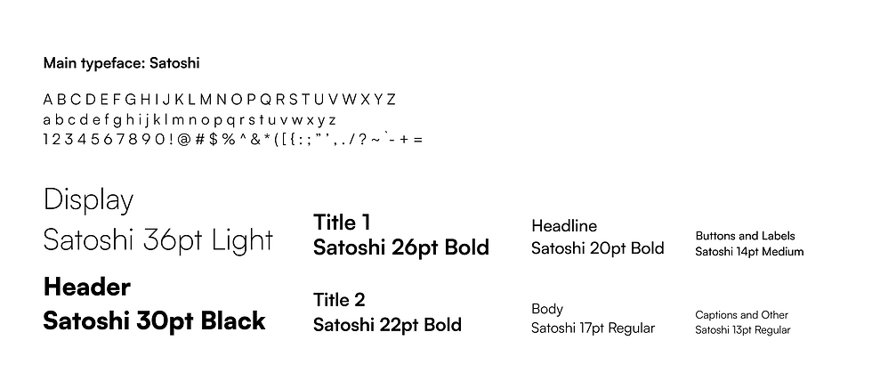
For my choice of typography, I stuck to a singular typeface. Researching the typefaces best for legibility of digital screens, I narrowed down my options to Satoshi. Satoshi manages to retain personality in its letterforms without compromising efficiency and legibility.
Choosing Florence, Italy as my sample city for the app, I chose to pull the color pallete from a mix of images from the city.
Components and Wireframes
Low Fidelity

Component Standardization

After receiving constructive feedback from my peers and professor, I was able to move onto developing the high-fidelity wireframes.
High Fidelity Wireframes

After further review with my peers and professor, I began to code each individual component with the help of the Figma to Builder.io plugin. View the semi-interactive components below.
Feature Breakdown
Fake user persona has been created for the purposes of demonstration.
User Onboarding

Users must have an account. Prompted to sign in or sign up.
Users input their basic information and all additional information needed to evaluate which recommendations to give.
Main Pages

Home page show trips planned. Curated page shows recommendations based on tags selected in onboarding
The home page has access to all basic functions of the app.
Users can access their trips, profile, curated page, and explore page with one click.
The curated page creates recommended locations for users based on their interests (tags selected during onboarding)
They can save and view the spots listed. They have access to all basic app functions from this page


The explore page allows users to search for locations using tag filtering. Tag groups are the main selectable filters, and use inclusive filtering.
Smaller filter button allows users to sort for locations that specifically carry that tag only.
List can be ordered based on distance, rating, and popularity.
For the explore page, users have access to the “swiping” view. An alternative way to browse through spots.

In the profile page, users can view their trips, interests, and friends.
Upon navigating to the profile settings page, any information added during onboarding can be changed and user can select different interest tags.

Users can access the trip page through both the home page and profile page.
Trip page will display any spots the user has saved and if they have added any to their trip plan.
Users can also see what tags have been selected for the trip and who else is partaking.
In settings, users can change trip details.
Saving and Planning Spots

There are many different way to save spots. Spot tiles in the curated page can add/remove spots to saved.
Spot briefs in the explore page can also do the same. Users can also save spots by swiping right while in the “swiping” mode.
All saved spots can be seen and edited in the Saved Spots page.

There are also a variety of ways to add a spot to your trip plan.
Users can either do it directly from their list of saved spots, or through a Spot page or the “swiping” mode of explore.
Trip plans can be edited in the Trip plan page directly, too.
Spot Info Pages

There are a few different ways spot info pages can be viewed.

Full-view spot info pages allow users to get more details about the location.
They are able to see images and reviews, as well as personalized and informed rating of the spot.

Users are even able to add reviews to spots to provide their own opinion.
Final Outcome
Full Userflow
Figma Files
Interactive Prototype
Final Reflection
I would love to keep working on this project, even after graduation.
I struggled quite a bit compiling what I made in Figma and making it interactive, but I was able to get the majority of the functionalities working, despite it only being a prototype.
In the future, it would be an exciting concept to continue to develop this. Exploring adding more features and pages (like a friend’s profile view) would be quite rewarding.
Also, the possibility for it to expand and become a real app would be ideal. I’d also love to design what the app icon would look like on a phone or in an app store.